
The theory
Why your colors actually matter (and how to stop guessing)
If you've ever bought a shirt you were excited about, only to hang it in your closet and never wear it again — the color was probably wrong. Not the fit, not the style. The color.
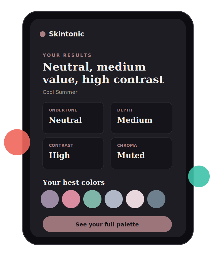
This isn't a personal failing. It's genuinely hard to know which colors work with your specific coloring, because the answer isn't "wear what's trendy" or "wear what looks good on the mannequin." It's about the relationship between the color and your skin, eyes, and hair — and that relationship is different for everyone.
This is the actual theory behind personal color analysis, explained properly — not as a horoscope, but as the real, testable reasoning professional colorists have used for decades.
The four things that actually determine your colors
Put these four together, and you get a real, reasoned answer — not a guess — for which colors are actually yours. They're the same four the analysis measures from your photo.
Undertone
Warm, cool or neutral
Underneath your skin's visible surface color, there's an underlying warmth or coolness — golden/peachy (warm) or pink/blue-based (cool), or somewhere genuinely in between. This is the single most important factor, because it decides which family of colors will look alive against your skin versus which will make you look tired or washed out. Warm undertones generally come alive next to golden, earthy, peachy colors. Cool undertones come alive next to blue-based, icy, or jewel-toned colors.
Depth (value)
Light to deep
This is how light or deep your overall coloring reads — and it's not just about your skin. Hair actually swings this the most, since it has the widest possible range (platinum blonde to jet black). Someone with very fair skin but jet black hair reads as "deep," not "light," because depth is about the whole picture, not skin alone.
Contrast
High to low
This is the gap between your lightest and darkest features — skin, hair, eyes. High contrast (think very fair skin with very dark hair) can carry bold, high-contrast color pairings. Low contrast (features that sit closer together in tone) tends to look better in softer, more blended color combinations. This is why an outfit that looks incredible on one person can look strangely harsh or flat on someone else with different natural contrast.
Chroma (clarity)
Clear to muted
This is how clear and saturated your natural coloring reads versus how soft and muted it is — driven largely by how vivid your eyes are and how much natural variation is in your hair. Clear, bright eyes tend to pair well with clean, saturated colors. Softer, more blended eye colors usually look better with dustier, more muted tones.
Why this actually matters
Fighting your coloring
— reads tired, sallow
Working with it
— reads clearer, more awake
It's not about vanity. Wearing colors that fight your natural coloring has a real, visible effect — it can make you look tired, sallow, or older than you are, even when you feel put-together. Wearing colors that work with your coloring does the opposite: people tend to look more awake, more vivid, healthier — often without anyone being able to say exactly why.
There's also a genuinely practical side: once you know your real palette, shopping gets faster and cheaper. You stop buying things "just in case" and start buying pieces you already know will work — with each other, and with you. A wardrobe built around your actual colors mixes and matches more easily, because everything shares an underlying harmony.
The old way vs. the new way
The old way
A colorist holding fabric to your face
- Usually $100–150
- Booked, in person, in daylight
- Judged by eye, reasoning rarely written down
- One sitting — no way to re-check later
The new way
The same four factors, from your own photo
- Free to try, no account
- About two minutes, wherever you are
- Every trait shown with its reasoning
- Your photo is analysed on your device, never uploaded
Traditionally, this kind of analysis only came from an in-person colorist — someone holding physical fabric swatches up to your face in natural light, one at a time, until a pattern emerges. It's a real, valid method. It's also usually $100–150, requires booking an appointment, and isn't accessible to most people.
Skintonic exists because that reasoning doesn't actually require an in-person appointment — it requires accurately sampling your real coloring and applying the same theory a professional would. You tap your own skin, eyes, and hair directly on your photo, and the same four-factor analysis (undertone, depth, contrast, chroma) runs instantly, for a fraction of the cost — with your photo never leaving your device.
Common mistakes people make without this
-
Guessing your undertone from vague signs — like vein color, which is actually a weak and often misleading indicator — instead of testing it properly. Two people can read as the same "shade" and still sit on opposite sides of this line.
Warm — golden
Cool — pink
-
Treating black as a universal neutral. It isn't. For many people, especially lighter and warmer coloring, black can be one of the harshest colors they can wear — not the safe default it's often treated as.
Black — harsh
Warm charcoal
-
Ignoring contrast entirely. Copying an outfit or color combination from someone with very different natural contrast than you is one of the most common reasons a "good" outfit doesn't translate from person to person.
High — wide gap
Low — close together
-
Assuming every version of a color is interchangeable. "Red" isn't one color — there's a warm, orange-leaning red and a cool, blue-leaning red, and most people look noticeably better in one than the other.
Warm red
orange-leaningCool red
blue-leaning -
Overlooking metals. Jewelry and glasses frames follow the same undertone logic as clothing — gold, silver, and rose gold aren't interchangeable, they're matched to warm, cool, and in-between undertones respectively.
Gold
warmSilver
coolRose gold
neutral
Common questions
Is my photo stored or shared anywhere?
No. Your photo is processed entirely in your browser using canvas — it's never uploaded to a server, never stored, and never seen by anyone, including us.
How is this different from a personality quiz?
Skintonic doesn't ask vague multiple-choice questions. It samples your actual skin, eye, and hair color directly from your photo (or your manual selection) and runs the same undertone, depth, contrast and chroma analysis a professional colorist uses — with the reasoning shown, not just a label.
How accurate is this compared to an in-person colorist?
An in-person colorist working with physical fabric drapes in controlled lighting will always be the gold standard. Skintonic gets you a genuinely reasoned, photo-based analysis in minutes — a strong starting point, not a replacement for professional consultation if you want the most precise result possible.
What does Skintonic cost?
$9, one-time. That includes your four core traits, your full 25+ color palette, the complete avoid list with reasoning, metal and makeup guidance, and the downloadable PDF report. No subscription, no recurring charge.
Do I need to create an account?
No. There's no sign-up, no login, and no email required to use Skintonic.
Can I use it without uploading a photo?
Yes — manual color pickers are available for skin, eye, and hair color if you'd rather not upload a photo, or want to fine-tune your result.
Does this work for all skin tones?
Yes. The four-factor analysis — undertone, depth, contrast and chroma — applies the same way across the full range of human skin tones. It's based on your specific coloring, not a fixed set of categories that only fit some people.
What if I lose access to my results?
Since nothing is stored on our servers, your results live only in your browser. If you clear your browser data or switch devices, your purchase itself isn't lost — contact us at skintonicapp@gmail.com and we'll help you regain access. If you've downloaded your PDF report, that stays saved on your device regardless, so we recommend downloading it right after unlocking.
Still have questions? Contact us
Try it yourself
You don't need to take our word for any of this — the whole point is that you can test your own actual undertone, depth, contrast, and chroma in a couple of minutes, see the real reasoning behind your result, and get a full palette built specifically around it.
Free, no account needed. Your photo is analysed on your device and never uploaded.